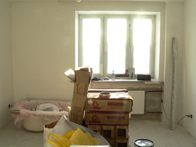
2. (Wall)Paperchase ...
by Tonie
(Saint Petersburg, Russia)
Hi again! This update is about the colour/style ideas for our apartment. For a home as small as ours, a cohesive colour treatment is critical. At the same time, we wanted each room to have a distinct feel!

The decision pretty much made itself, because the first thing we got was a brand new entrance door in wenge, a deep, dark chocolate brown.
This door is one of five in our hallway, so it was quite obvious that all those doors should match. And if all the doors are colored wenge, this colour is already present in every room of the apartment.
Next, we looked at the atmosphere we wanted to create in each space in our apartment: I wanted the hallway to feel welcoming, cheerful, but warm and calming at the same time. Warmth and tranquility would also be nice in the bathroom. The kitchen already has a warm feel because of its south facing windows, and all the appliances warm it up even more, so I wanted some cooler colours in the kitchen.
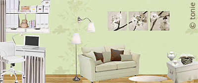
The bedroom colour scheme got a lot of input from Theo, my then-fiancé, who wanted the bedroom 'to be green'. This dovetailed very nicely with my ‘discovery’ of chocolate+mint+ivory+straw – a colour combination that, for some reason, gives me a perfect 'at home' feeling.
So, when I started shopping for flooring and wallpapers, I only had one fixed colour scheme to consider - the one for the bedroom ... plus the wenge doors.
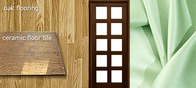
First up was the flooring. We wanted it to flow smoothly from one room to the other, and also to look good with the doors, so we opted for oak coloured ceramic tiles for the hallway, bathroom, toilet and kitchen, and real oak parquet flooring for the bedroom.
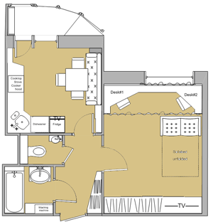
Next, the wall treatment.
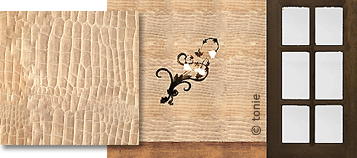
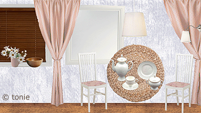
For the hallway, we found some gorgeous 'crocodile skin' textured wallpaper of a pearlescent, peachy colour with a slight hint of green underneath. It seemed too glamorous at first sight, but then we decided it would add a bit of zest to our tiny little hallway.
It wasn't intended to be this way, but the wall tiles for the bathroom perfectly matched the hallway wallpaper in colour – probably because I had a similar kind of relaxed, cheerful mood in mind for both rooms.
The kitchen is getting ‘stone’ textured wallpaper in an interesting grey colour with a very light lavender hue that reveals itself near something white or wooden, particularly our oak coloured floor tiles.

I spent lots of time looking for the right mint-colored wallpaper for the bedroom. For some reason, it's very hard in my part of the world to find plain coloured wallpapers if you're on a budget, especially when you know exactly what you need. But I got lucky! I found almost plain wallpapers - marble textured actually - that looked cool mint under cooler lighting, and warm mint (almost lime green) under warmer lighting. I love this effect!
I knew I should be very careful with patterns in such a small apartment, but for the bedroom I just couldn’t resist. I decided to separate the bedroom/living room area from the office part by adding ‘embossed’ flower decals that are the same colour as the rest of the walls. They add to the elegance of the room, help separate out functional zones and are a beautiful detail that catches your eye.
As for the style, we both tend to go for a classic look in most things, and interior design is no exception. I would like to add a country touch to our home, but keep it subtle enough to be appropriate for a young couple's modern apartment in a big city.
As I see it now, the design concept for our apartment is about “tamed nature” (in a positive sense) - we've got lots of natural materials here (or quasi-natural to make it cheaper), but they are all more refined than it would be the case in a country house. Our walls are smooth, everything is square and straight where it's supposed to be, and the crocodile skin wallpaper of the hallway adds to the concept of ‘tamed nature’ as well ;-)
This thought really occurred to me after I chose all the wallpapers and the flooring, which probably isn't the way professional designers work, but in this case my intuition didn't let me down. There’s also an interesting connection to the concept of starting a family, which makes me think it really works for us!
Next time, I’ll report on how all these ideas are translating into (gritty) reality :-)
Comments for 2. (Wall)Paperchase ...
|
||
|
||
|
||
