Basic Color Wheel Template
A basic color wheel template is about color relationships. The color mixing wheel shows you how to mix primary colors and create (basic) color schemes. On this page, I review a commercial color wheel (Daler-Rowney).
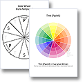
For more color wheel info & free printables, click a pic:
This Page ...
... is a review of a commercial, basic color wheel (Daler-Rowney).
Use the links to navigate, or just read on!
- Basic Color Mixing Wheel: Here's What You Get
- Cool & Warm Colors
- Complementary, Triadic, Tetradic & Analogous Color Schemes On The Color Wheel Template
- Tints, Tones & Shades
- Limitations Of The Color Wheel Chart
- Buying A Color Mixing Wheel
Basic Color Wheel Chart: Here's What You Get
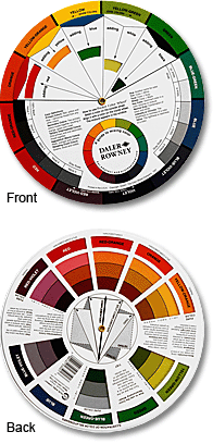
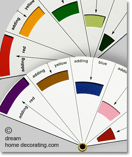
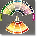
You can buy color wheel templates in most paint supply stores, and you'll generally get something like this Daler-Rowney color mixing wheel, pictured left and published by The Color Wheel Company ™ in 2007.
Color mixing charts come in different sizes. This one is pocket-sized (just over 5"),
and you'll need good eyesight or - like me - brand new glasses to read the text on it ;-)
The chart is a typical 3-primary color mixing wheel. It is based on the assumption
that there are only 3 primary colors - red, yellow, and blue.
When you mix the primary colors, you get secondary and tertiary colors.
When you mix any color with white, gray, or black, you'll get tints, tones & shades. A basic color wheel should show you both of these categories.
Use a color mixing wheel to learn about colors, not to pick colors for your home. It's a pretty basic tool (but you'll still get value for your money).
In addition to the tips for mixing primary colors, this basic color wheel chart
provides a little 'lexicon' of color-related terms like 'hue',
'tint', 'key color', 'intensity', 'chroma', 'value', and so on.
And the template isn't just a color mixing wheel. It explains, in simple terms, how to combine colors into color schemes:
- monochromatic,
- analogous,
- achromatic,
- complementary,
- split complementary,
- triadic, and
- tetradic.
As you can see in the photo below, this color mixing wheel is made up of three layers;
the back and front layers have cut-out 'windows' that you can align with the different
color swatches on the actual color wheel template (which is sandwiched into the middle) to access the
information you're looking for.

So here's my preliminary verdict: a basic color wheel template will give you at least
a basic understanding of color relationships, and of the terms that
are commonly used to describe them.
Is it worth the money? I'd say yes, particularly if you're just starting out on your way to becoming a color expert. It is a minor expense - a few dollars - and it's a handy little tool to carry around with you.
(Just in case you would like some more in-depth information about the color mixing
wheel right this minute, have a look at the main color wheel
chart page on this site.)
(Return to Top)
Cool And Warm Colors
A basic color mixing wheel can help you differentiate between 'cool' and 'warm' colors. And while it is important to understand differences in color temperature, I'm not convinced that this particular color wheel template has got it quite right.
Judge for yourself:
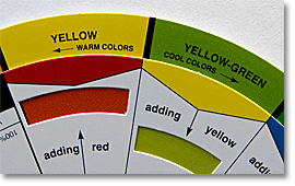
At the other end of the divide, the line between cool and warm colors is drawn between 'violet' (cool) and 'red-violet' (warm) - which doesn't strike me as particularly convincing either (red-violet can be seen as a cool red, or as a warm violet.) So why this strange division?
I guess the publishers felt the need to draw a neat line down the middle of their basic color wheel chart and create a 'warm' and a 'cool' half. But since two of the 3 primary colors are generally considered warm colors (yellow and red), this can't work.
On a 3-primary
color wheel template, you'll automatically end up with more warm colors than cool ones. (Whereas the 4-primary color model has equal numbers of both!)
(Return to Top)
Complementary, Triadic, Tetradic,
And Analogous Color
Schemes
When you mix two primary colors, the resulting color will be complementary to the
third primary color. (Read more about the basics of
complementary colors here)!
On the 3-primary color mixing wheel, the complementary colors sit directly opposite each other, and we get the following pairings:
- blue/orange
- blue-green/red-orange
- green/red
- yellow-green/red-violet
- yellow/violet
- yellow-orange/blue-violet
The next color scheme option you find on the basic color wheel template is a split-complementary color scheme, where instead of one color and its direct opposite (=complementary), you pick one color and the hues either side of its complementary color, for example:
- blue plus yellow-orange & red-orange,
- yellow plus red-violet & blue-violet,
- and so on.
Next up, 'triadic' color schemes. A triadic color scheme uses three equidistant colors on the basic color wheel chart, for example
- blue, red, yellow,
- green, violet, orange,
- yellow-green, red-orange, blue-violet,
- ... and so on, around the color mixing wheel.
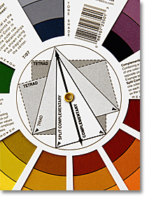
You can see how these color combinations would be extremely in-your-face if you used them all as highly saturated colors. I personally don't think I could live inside a full-on triadic color scheme.
On the other hand, there have been experiments
in the past, using at least the 3 primary colors in interior design and decorating.
Next come the tetradic color schemes, which use a choice of four colors from the basic color wheel. There are several ways to choose, as long as the four colors sit at the ends of a rectangle (see photo to the right).
Just one example:
- yellow-orange/yellow-green/red-violet/blue-violet (this works like a double-split complementary color scheme), or
- yellow-orange/green/blue-violet/red ...
... both of these make valid tetradic color schemes. Now, if you asked me (which you haven't, but I'll volunteer my opinion) - who in the world would surround themselves with all these high-octane colors in their home?
I can understand a few cute Alessi kitchen gadgets in juicy
colors, but - sofas? ... wall colors? ... carpets? In four
different, saturate colors? In the same room?
Well, it's important to understand that the color mixing wheel wasn't invented for interior decorators.
It was mainly developed by painters, to help them understand how paint colors 'hang together'.
So if you want to use a basic color wheel template to develop a paint and decorating scheme for
your home, then use the chart as a rough guide only. (More about that below!)
Having said all that, if you look at the analogous color relationships,
you'll see that one of the features of this particular color mixing wheel may actually be
quite useful for interior decorators.
Strictly speaking, analogous color relationships can only involve one hue on the basic color wheel template, plus its immediate neighbor to the left or right, for example red & red-orange, or red & red-violet.
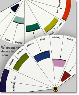
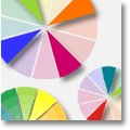
However, let's play with that concept a little bit, because the color mixing wheel very neatly shows different color intensities in adjacent colors. Above and right are a few examples.
What do you think? I find some of these color combinations could inspire good color schemes.
I'm thinking retro kitchen - 40s living-room - Arts & Crafts or mid-century modern home
office - that kind of thing.
Next, let's quickly look at the way the basic color wheel template helps you understand ...
(Return to Top)
... Tints, Tones, and Shades.
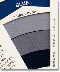
The basic color wheel has two ways of showing what you get if you mix primary and secondary
colors with white, gray, and black.
Firstly, it shows every hue on the color mixing wheel as a tint, a tone, and a shade.
In the photo left, you can see that the color printing appears rather crude, but it can still help you imagine what a 'grayed' blue will look like.
You can use a list of tints, tones, and shades as the basis for a
monochromatic
color scheme (which is supposed to contain nothing but different mixes of one hue with
white, gray, and black).
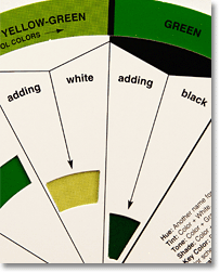
The second way to use the basic color wheel with non-colors is this:
Whenever you wonder what a particular hue on your color mixing wheel would look like with
added white or black - just turn the chart over, and align the color in question with the
'adding white' or the 'adding black' window. Result!
(Return to Top)
Limitations of the Basic Color Wheel Template
The 3-primary, basic color wheel template is a neat little system. And ... it clearly has its limitations.
Firstly, there are strong arguments for including the color green on the basic color wheel, because we see green as a primary color.However, the 3-primary color wheel has become something of an unquestioned dogma for art teachers, paint suppliers, and a lot of interior designers - while the four-primary color chart was quietly adopted as the basic color model for the Natural Color System (which, in turn, is the foundation of pretty much all modern paint colors).
So if you want to try something outside the 3-primary-color box, experiment with non-'complementary' color pairings like:
- lime green and violet,
- turquoise and orange,
- lemon yellow and bluish purple...
... which are all "opposing" colors on the 4-primary color mixing wheel. And see what you think
of the results!
Secondly, the basic color wheel template isn't that great for mixing primary colors (or secondary, or tertiary colors) into 'tetradic' color schemes. Try finding a tetradic color scheme for, say, red-orange, and you'll see what I mean:
You'll get either red-orange plus yellow-orange/blue-green/blue-violet, or red-orange plus yellow/blue-green/violet. Both combinations, frankly, look like accidents in the paint box. And you'll find similarly strange tetradic color schemes around the whole basic color wheel.
Of course, you can try using some of the colors as tints or shades, but a color wheel
template won't help you visualize these as a combination.
Thirdly, the basic color wheel template can only mix primary colors with white, black, and super-neutral gray. It does not cover the subtler color mixes that involve almost-neutral colors like cream, beige, different brown hues, cool or warm gray, and so on.
And the point is that most good color schemes work because the colors aren't all used in their highly saturated forms. (So if you want some inspiration for sophisticated room color schemes, you'll be better off investing the money in a glossy shelter mag ;-)
Alternatively, experiment: Instead of combining a lollipop version of brilliant orange and turquoise that you get from the basic color wheel, try burnt orange (=orange mixed with burnt umber and raw sienna pigments) and the palest, most transparent-looking aqua you can find (=turquoise plus loads of white, plus a teeny bit of red-orange or gray). And see what kind of room (or gift wrap, or table decor...) you get with that.
Nice examples of these subtler color combinations are on the pages about ...
♦ Tuscan Paint Colors,
♦ Orange Bedrooms, and
♦ Orange Color Schemes!
The upshot of all this? A basic color wheel really is just that, basic. Start with it - use it to learn about color relationships - and then forget it. Your own experiments will
teach you much more about color than a color mixing wheel could ever provide.
Buy A Basic Color Wheel Here:
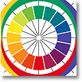
More Info Here (Click A Pic):
Yet to find the information you're looking for? Type a word or phrase into the search box below:



New! Comments
Have your say about what you just read! Leave me a comment in the box below.