Color Theory In Art, Design & Decorating:
Useful Color Terminology
Color theory in art: Here's a quick show-and-tell of illustrated color terms.
I. Color Properties: Hue, Tint, Shade, Tone, Saturation, Value.
II. Color Relationships: Primary/Secondary/Tertiary, Complementary & Split-Complementary, Analogous, Monochromatic, Triadic, Tetradic.
Color Theory in Art & Design I: Color Properties
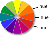
1. Hue
Hue is what makes a color identifiable and different from any other color, e.g. orange, red-orange, red.
Hues are determined (and can be measured) by a color's wavelength.
There are millions of hues around the color wheel chart, but the human eye & brain cannot distinguish them all from each other. This diagram is a rather simplified color model.
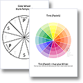
If you're studying or teaching color theory, download an A4-sized printable color wheel chart here.
2. Tint
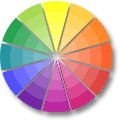
A tint is a color plus white. The addition of white makes the color paler and less saturate. (Another word for 'tint' is 'pastel').
In English color terminology, the only tint that comes with its own name is pink (a tint of red).
All other tints are just called 'light blue', 'light green' and so on. Download a color wheel of tints here.
3. Shade
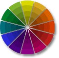
A shade is a color plus black.
Dark blue, in other words, is blue that has been darkened by adding black.
Download & print an online color wheel of shades from the Free Printable Color Wheel page!
4. Tone
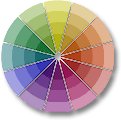
A tone is a color plus grey (i.e. white as well as black).
When you add white & black to a color, it will look 'toned down', i.e. less brilliant and saturate.
Students/teachers of color theory in art, download a tonal color wheel from the color theory resource page.
5. Saturation

Saturation is the degree of intensity ('chroma'), purity and brilliance of a color.
You can gradually desaturate a color by adding black, white or grey, or by mixing it with another color that has itself been muddied down (brown is a good candidate for desaturating other colors!).
A completely desaturated color is called achromatic (=colorless).
6. Value

The value of a color is its relative lightness or darkness (i.e. whiteness or blackness), irrespective of its saturation.
Color Theory in Art & Design II:
Color Relationships
7. Primary, Secondary & Tertiary Colors
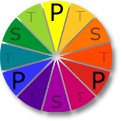
3-Primary Color Wheel
Color theory in art is based on the 3-primary color wheel chart (a.k.a. 'color mixing wheel' or 'artist color wheel'). According to color theory in art, all hues can be mixed out of three primary colors ...
... yellow, red, and blue. (Read all about mixing secondary and tertiary colors here!)
4-Primary Color Wheel
The 4-primary color wheel chart adds green as the fourth primary color. This color model is important for designers and decorators because
- It represents how the human eye sees color.
- It shows convincingly how warm and cool colors work.
- It also provides interesting sets of 'opposing', triadic and tetradic color schemes.
8. Complementaries & Split-Complementaries
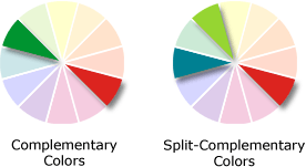
On the 3-primary color mixing wheel, complementary colors always sit opposite each other.
They "complement" (=complete) each other to a quasi-neutral grey when you mix them 1:1.
Split complementaries, however, are not about mixing paint. They are about creating pleasing color combinations for design/decorating projects. For a split-complementary color scheme, you combine a color with the two colors to the right and left of its complementary on the color wheel.
More about complementaries & split complementaries here (includes room color scheme examples).
9. Analogous Color Schemes
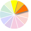
Analogous (related) colors are adjacent to each other on the color wheel. They usually combine to harmonious color schemes.
Some examples:
- blue & green ('seaside' colors)
- red-orange, red/pink, fuchsia
- lime, lemon, orange ('citrus' color scheme)
10. Monochromatic Color Schemes
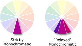
Color theory in art & photography employs a strict rule for monochromatic color schemes: they can only consist of one hue plus tints, shades and/or tones of that hue.
In interior design, however, the term 'monochromatic' is often more loosely applied to decorating color schemes that focus on one color, e.g. green, but include several hues of that color, e.g. lime, olive, turquoise, pine.
Read more about monochromatic color schemes for interiors here.
11. Triadic Color Schemes
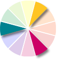
A triadic color scheme combines three equidistant colors on the color wheel chart ("tria" means "three" in Greek).
Since all three hues come from different color groups, this can look quite garish when you use highly saturate colors.
The best way to handle triadic color schemes is to
- use gentle, less saturate colors and
- let one color dominate.
12. Tetradic Color Schemes
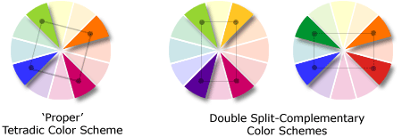
Tetradic color schemes consist of four hues from the color wheel. If you place a square or rectangle on the color wheel chart (as above), its corners will indicate a 'tetrad' of color ("tetra" means "four" in Greek).
The 'rectangular' models to the right can be described as 'double-split-complementary' color combinations. This version of the tetradic color scheme is more usable for interior design color schemes because it works similarly to a complementary color scheme: it really employs just two opposing color groups that (usually) go well together.
More Info: Click A Pic!
Color Theory In Art:
Color Mixing Charts To Buy
Color Theory In Design & Decorating:
Color Inspiration
Yet to find the information you're looking for? Type a word or phrase into the search box below:


New! Comments
Have your say about what you just read! Leave me a comment in the box below.