Color Wheel Chart & Basic Color Theory

A color wheel chart can tell you how colors relate to each other, which ones might work together and which ones probably won't.
But use it with caution, particularly in decorating and design - there's more to the color mixing wheel than mixing primary colors.
You'll find all the basics in these color theory articles!
Click a Pic:
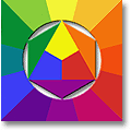 Online Artist Color Wheel |
 Free printable Color Wheel Design |
 BUY A Basic Color Wheel |
 Great Color Combinations |
The 3-Primary Color Wheel Chart
(a.k.a. Artist Color Wheel / Color Mixing Wheel)
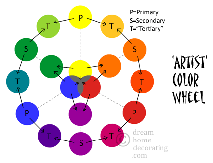
The artist's color wheel is the color mixing chart we all learn at school.
It was developed by painters for painters from the 18th century onward.
It is about mixing paint colors from 3 primary colors.
This color model does not contain brown, and therefore it is of limited use for interior designers and decorators. (More about this below!)
Also, even though it's called an 'artist' color wheel, it won't necessarily help you pick great color combinations, because color combining doesn't follow the same rules as color mixing.
But it's a very good model to show how color works. Here's how:
a) Primary Colors
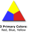
The three basic, primary colors are yellow, red, and blue. In theory, you can mix absolutely any color from this initial set.
If you mix all three primary colors in equal parts, you're supposed to get the color black. However, in reality you hardly ever do get black. Most paint pigments mix into some kind of murky gray :-)
b) Secondary Colors / Complementary Pairs
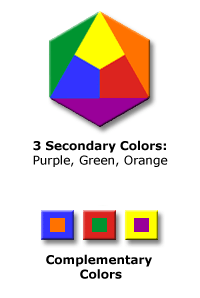
When you mix any two primary colors, you get the secondary colors:
♦ yellow and blue produce green,
♦ blue and red produce purple,
♦ red and yellow produce orange.
This leaves each primary color with a complementary color (mixed from the other two primaries). The complementary pairs are:
♦ blue/orange,
♦ red/green, and
♦ yellow/purple.
Each pair complement (='complete') each other to produce a neutral color.
In other words:
a) you mix two primary colors into a secondary (orange, purple, or green),
b) then you add the third primary color (which wasn't in the first mix) ...
and your three primaries reunite before your eyes to the old murky gray.
c) "Tertiary" Colors
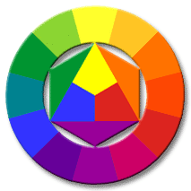
On the third level, we now mix primary with secondary colors, all the way round the color wheel chart (this is where the fun really starts!)
These mixtures are sometimes called 'tertiary' colors, but the term is not used in the same way everywhere.
Here's what you get:
♦ blue (primary) + green (secondary)
= turquoise
♦ blue (primary) + purple (secondary)
= blue-violet
♦ red (primary) + purple (secondary) = red-violet or crimson
♦ red (primary) + orange (secondary) = red-orange
♦ yellow (primary) + orange (secondary) = yellow-orange
♦ yellow (primary) + green (secondary) = lime green
When you align the 3 primary colors with the secondary and 'tertiary' colors around the outer ring of the color wheel chart, the complementary pairs always sit directly opposite each other on the outer ring.

But What About ...
- Split Complementaries?
- Hue, tint, shade & tone, and all the other color terms?
- Triadic & tetradic color schemes?
- Other color wheel models?
- And are there really only 3 Primary Colors?
Take-Home Thoughts For Decorators
1 A color wheel chart is about how we see or mix colors. It is not a model of how colors should be combined. So don't sweat it - there's no such thing as a "correct" color scheme! However, do check out some great color combinations here, and lovely examples of bedroom color palettes here.
2 A simple color wheel chart has limited value as a model of 'real-life' color:
- In real life, most colors are not brights - they've been dulled down by admixtures of neutral colors like gray, black and brown.
-
The color wheel does not include brown. The color brown consists of black plus a mix of several primary and secondary colors; it sinmply can't be 'mapped' onto the color wheel chart because it is too complex for this model.
However, brown is also one of the most-used decorating colors, and as an interior designer, you need to see the colors that are 'hidden' in brown & other neutrals. Find out more about this in my FREE e-book, Stylish Neutrals!
If You're Here To Buy A Color Wheel Chart ...
... welcome to my online Color Wheel Shop (in partnership with Amazon).
Take your pick:
Further Reading:
Teaching & Learning Resource:

Printable
Color Wheel
Free Printable Color Wheel templates for use in your classroom or studies (or in case you need some online color wheel pictures).
The page contains:
a) color mixing wheel ('artist' color wheel);
b) 4-primary color wheel chart (Ewald Hering);
c) color wheel pictures for hue, tint, shade & tone;
d) blank color wheel templates for your own color mixing experiments.
"Design" Color Wheel Chart
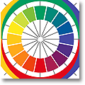
4-Primary
Color Wheel
If you're looking for an online color wheel that is not about mixing primary colors, try Ewald Hering's 4-Primary Color Wheel.
This color wheel chart is much more useful as a design color wheel because
- it's about the way we see color;
- it shows how warm & cool colors really work;
- it has a rather gorgeous set of 'opposing' colors that make good decorating color schemes.
Basic Color Wheel Chart
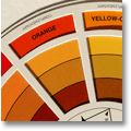
Basic Color Wheel
The 'interior decorating' color wheel you can buy in paint supply stores is usually just a Basic Color Wheel for mixing colors.
It's a painters' color wheel rather than a design color wheel: It shows how to mix paint colors, not how to combine them successfully.
However, it does explain useful basic color terms like 'hue', 'tint', 'shade', 'tone', 'monochromatic', 'analogous', 'complementary', 'triadic', and so on.
Basic Color Theory:
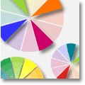
Illustrated
Color Terms
Knowing Basic Color Theory is extremely valuable, no matter whether you're designing a room color scheme or 'just' wrapping a present.
Here's an illustrated list of 15 useful color terms.
Knowing them will help you identify ...
- How a color might fit into a color scheme, and
- How to manipulate color schemes so they look great.
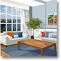
Color Wheel:
Complementary
Colors
Where are the Complementary Colors on the color wheel chart? What can you do with them? And what do split complementary colors look like?
Oh, and why is 'complementary' the correct spelling?
This article has answers to all of the above, plus
- Complete sets of complementary & split-complementary color swatches, as well as
- 4 complementary (and complimentary ;-) room color scheme ideas.

Warm/Cool Color
While it is true that 'warm' colors belong to the yellow/red section of the color wheel chart and 'cool' colors to the green/blue section, there is much more to Warm And Cool Colors than this. Here's a 'secret key' to amazing color schemes for
- interiors,
- design projects, and
- crafts!

Primary Colors
3 Primary Colors are sufficient for mixing all paint colors (at least in theory). So they make a good starting point for a paint color mixing chart - but are they sufficient for other jobs as well?
Not if you work in the paint industry, or design contemporary logos.
So how many primary colors do we actually need?

Monochromatic
Color Schemes
'Monochromatic' Color Schemes come in degrees:
They can vary from extremely purist combinations (one hue plus the non-colors black & white) to almost analogous color schemes (say, a variety of bluish greens and greenish blues).
The article takes one room through several monochromatic color schemes - see how it works!
For More Decorating Info & Inspiration,
Click A Pic:
And for additional color scheme inspiration, check out this little bookshop, too (in partnership with Amazon):
Yet to find the information you're looking for? Type a word or phrase into the search box below:




New! Comments
Have your say about what you just read! Leave me a comment in the box below.