Country Cabin Decor: A Log Cabin in Canada
by Maureen
(Canada)
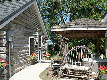
1850's Log Cabin
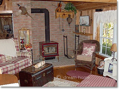
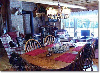
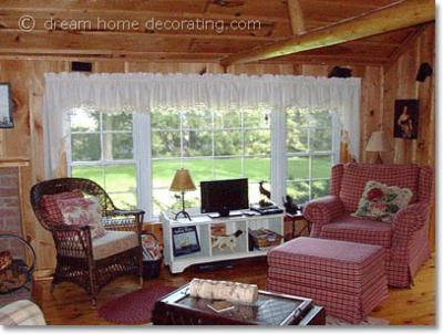
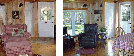
I liked our cabin as it was, but with the cute Battenberg lace curtain valances and the poofy chair, I felt the decor 'dated' the owners. The cabin looked more like a little old Grandma house - too frilly, too country Victorian. (Not that there is anything wrong with that, it's just that we're not exactly there ... YET ;-)
The photos above show our BEFORE the changes. Here are a few more pics:
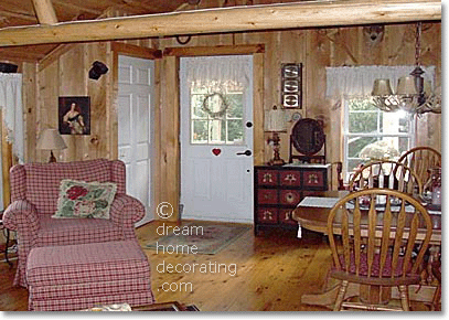
View from the stove to the entrance door
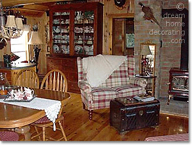
View from the entrance to the old loveseat & kitchen area
What we changed:
1. Replaced the window treatments
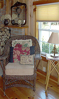
With the boar head on the wall, and other hunting themed things, I felt the Battenberg lace curtains looked a little too charming.
All that was missing was Little Red Riding Hood! LOL!
But I saved these valances, so perhaps one day, when our motorcycles are put away .... ;-)
In the meantime, we had custom made-to-fit pleated shades mounted under the inside window trim. They're in a caramel-colour slubbed sort of linen look to match the pine walls.
When the sun is really bright or the day is bitterly cold (or baking hot) we can pull them down to keep the warmth in or vice versa. When not in use, they snug right up to the window trim at the top, and they are practically invisible.
The window is wide but not very high; this is due to the fact it used to be two windows long ago when it was just a cabin in the woods used by pioneer settlers, before the area was more developed, and then used as a cottage on weekends.
The previous owners covered the logs on the inside with insulation of sorts and board and batten and tried to maximize the view and light by making the window wider.
But it was kept the same height it was originally over 150 years ago. Only the main entrance door from the outside is of 'normal' dimensions.
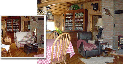
2. Replaced the loveseat and the poofy chair
The reason I changed the loveseat on the left to a chair is that the love seat was
a) uncomfortable - you couldn't lie down on it. And if you wanted to watch a movie, you couldn't get comfy - or had to hang your feet over the arms.
b) in the way. You had to walk around it to get to the hallways to the rest of the rooms in the cabin. Perhaps not good "Feng Shui" and it looked - well, odd. LOL! I searched all over and couldn't find one of smaller dimensions.
The new leather look wall-away recliner chairs take up little space, and they weren't over-stuffed looking. I think they add more of a masculine feel to this room.
The chairs are a soft microfibre material and can be placed only 3" from the wall when reclined in full. I liked that they are INcliner chairs, actually. When you move the handle on the bottom right, they go down and out. To go back to upright position, you kick the footstool part back in. (The backs of REcliner chairs just recline back and take up a lot of room when opened up.)
The micro fibre is an excellent, no maintenance fabric: spills run right off, but it feels and looks like suede leather. Fools everybody!
It is also better suited to use than real leather when subjected to the intense heat the woodstove throws out, which is the only heat source used in this 900 sq.ft. cabin.
The chairs are awesome when the fire is going and the snow is blowing!! (Caution: One can fall asleep very easily in these chairs!)
3. Created a 'vestibule'
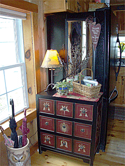
Having an outside door entrance right into this kitchen presented its own challenges of how to define an entrance way reception area with such little space.
So I bought a small black and red bureau to store hats and mitts in, plus some writing supplies and put a small lamp on it and a vase of pussy willows, and a small basket for a mini catch-all.
I purchased a wardrobe style mirror that had metal brackets so it could be hung over a door. I straightened out these brackets and made them "L" shaped and fixed them to fit over the black colour refrigerator which I felt was an eyesore.
With the bureau in place and a porcelain umbrella stand featuring images of owls, it "works" as a cute vestibule.
4. Ditched the area rug
I didn't want an area rug in the cabin, as a rug will define a space and as the furniture placement in this room is basically a triangle, I feel that walking on the corner of a square rug in the conversation area would be odd.
So I am letting the wood floors show off their character that pine gets - dents, knots ... it is a very soft wood.
I didn't want the room to be boring, so I used a sheepskin rug for the scatter mat in front of the other chair.
I guess I could have gone with an oval shaped rug, but what a hassle to vacuum as my husband frequently brings in the wood for the fire and walks through this area in his boots to get to the wood cradle! (Bless this man for keeping us cosy during those freezing Canadian winters!)
What We Kept
1. Dining area & steamer trunk
The oak table and chairs are comfortable amid the pine walls.
The antler chandelier over the table is a real conversation piece, as is the antique long gun over the door and the snowshoes high up on the wall beside the deer head.
The antique steamer trunk used to be our coffee table; we now use it as a perch for the small television that keeps us grounded to the daily world events (without obscuring the beautiful lakeside view).
2. General color & decorating scheme
As the cabin kitchen / great room is so small, I decided to limit the amount of colours and pattern.
The appliances are black, espresso and juicer machines are stainless steel, the upholstery is chocolate brown.
To cosy this space up, I chose deep burgundy red for the main accent colour as on the decorative shelf over the counter, (red is a great kitchen colour / stimulates appetite) braided seat pads and little scatter rug in front of the one recliner chair.
A cabin kitchen that is rustic needs only a simple pattern. Checked table cloth, braided rug and seat pads are of the same colour as the table cloth.
Simple casual flowers in a porcelain pitcher on the table look cheerful and add a feminine touch to this rustic abode!
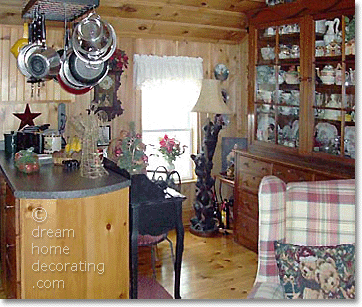
My kitchen
Renate's Reply: Maureen, this is country cabin decor at its most charming - thanks for sharing your lakeside cabin with the world! Lovely pictures, too - I can almost hear the fire crackling. Thank you for inviting us in!
Comments for Country Cabin Decor: A Log Cabin in Canada
|
||
|
||
|
||
|
||
|
||
|
||
|
||
