Home Remodel, Step 3: The Stand Back and Duck the Flying Plaster Stage
by Wanasai
(Hobart, Tasmania, Australia)

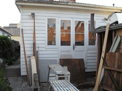
Back Wall / Bathroom Before French Doors
The builders arrived when they said they would, did the work they said they would, saved me money wherever they could, and came up with great suggestions as they went along - what more could you ask for?
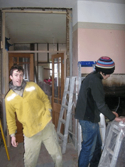
In hindsight this was probably some sort of miracle, but not having had any experience with builders before, I just thought it was normal ...
... only in delving into other people's renovation stories did I realise just how lucky I was!
- One pair that I had planned to lead from the kitchen (former bathroom) out onto the deck - plus a pair of matching side-light windows, so that the majority of the back wall was a window/door combination that opened the room up to the light and the view (see the photos above)
- A second pair to replace a small regular window in the living room (see pics below!)
- And a third pair to replace a regular door between the lounge room and the second bedroom (photos further down), thus enabling the bedroom to be opened up to the lounge room, flooding light through both areas ... delicious!
Here's the thoroughly uninspiring lounge room window, replaced by French doors plus fanlights above for added light:
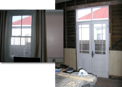
I also found some pine single doors with frames on the top half for glass panels, that sorta kinda matched the French doors ... yes! These would be fantastic to let additional light into the passage, and the bathroom, and the living room!
The next lucky inspiration came whilst removing plaster and timbering to make room for the French doors: I realised that the space between the top of the doors and the 12 foot ceilings could be easily filled in with glass rather than replastered, and the builders encouraged me to do this throughout the house.
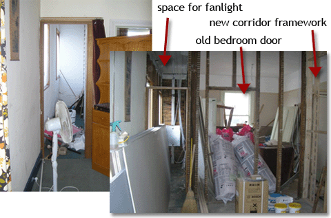
In hindsight this has been one of the most dramatic elements of the renovation, and light bounces around the house in delightful ways – both natural and evening illumination ... the photos give a good idea of this.
With letting in so much light I discarded one of my original ideas for skylights throughout the length of the long narrow house ... just didn't need them, and what I had was even better - giving character as well as light.
The structural changes were dramatic in their speed – and their impact - on the atmosphere of the house and on my budget!
Other things the builders did for me was to remove two out-of-character fireplace surrounds, which simplified the decorative elements to the beautiful light-creating doors.
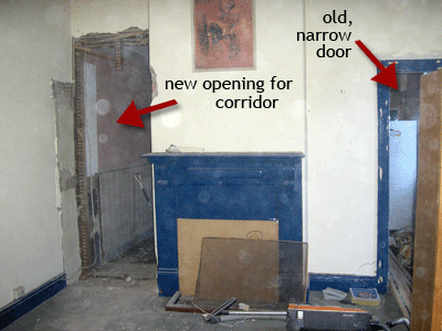
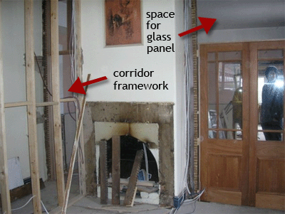
I put the fire surround out on the street with a sign "for sale to good home only - $80" and that weekend many passers-by were amused, with the fireplace surround eventually being bought by a close neighbour who wanted to match an existing one in her house across the road!
Comment from Renate:
For a Brit to read that you pulled out a fireplace surround would be almost painful ... over here, if it's old & fitted & it works, you leave it because it's an 'original feature' & will be a strong selling point. How is that different in Tassie?
Wanasai's Reply:
As for the fireplace surround, well the house has very small rooms and as far as I could ascertain the fireplace surround was the wrong period, and much too decorative for the very plain style of the working man's cottage, so my guess is the original had been removed some time earlier.
Things like this always demand serous thought, and I gave it plenty, but somehow I knew the plain lines of the chimney, which had beautifully smoothed rounded edges, was the feature of the room in all its simplicity, not the elaborately turned commercial looking surround!
I will put before and after photos so you can have a look and give your opinion - discussions like these are very interesting to decorators, so it's good to have them!
It was also an issue for consideration whether to remove or replace the dado in the lounge room ... it had been knocked around, bits removed, and the capping was in terrible condition, but the skirting boards were nice and deep and original, so I kept the dado and skirting and replaced the capping and it looks really great ... again I will take some detailed pics.
My attitude to this house is, to fix what needs fixing and leave what doesn't! And bear in mind that it needs to remain a living breathing organic thing, rather than be a museum piece .. hence I was happy to put in the fanlights above the doors, replace the damaged doors with repro French doors with (tempered) glass and so on ... and believe me, anything of interest HAS been kept!
One of the old mantels I have kept, with the original corbels, and I am going to reuse these somewhere in the house, but not as a mantel .... hmmm that will be interesting!
And I have decided to definitely paint the kitchen / bathroom floor, as is made of 3 different materials - concrete, floorboards and chipboard - and I want to integrate the organic growth and history rather than just putting vinyl down ....a sort of retro blue with a bit of black in as the background, and red-and-green roses!!!!!! That's going to be a fun, messy job ...
Renate's comment: Wow, this is shaping up to be a piece of art ... can't wait for photos of that flooring!
Comments for Home Remodel, Step 3: The Stand Back and Duck the Flying Plaster Stage
|
||
|
||
|
||


