Contemporary Norwegian Home
Expert Interview: Tonje Boganes
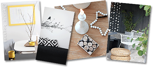
Among Norwegian home design bloggers, Tonje Boganes caught my eye ...
... with her elegant, pared-down style and beautifully composed interior design photos.
Her picture-perfect decorating blog chronicles the evolution of her Scandinavian style home in Norway.
Tonje's blog has been featured in several Scandinavian interior design magazines as well as in a recent book by Franciska Munck-Johansen, Sanselige Rom (Sensuous Room).
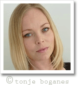
On this page, Tonje will take us on a guided house tour and give us the low-down on contemporary Scandinavian interior design.
Renate: Hello Tonje, welcome to Dream Home Decorating, and thanks for talking to us today!
Tonje: Hi Renate! Thank you for the invitation and the opportunity to share my home and my pictures with your readers. It is an honor!
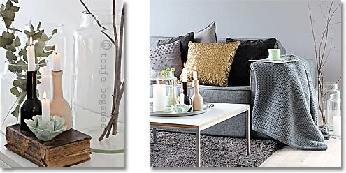
Tonje's Norwegian home: live candles and rich textures
Renate: Tonje, you live in a low-key, contemporary Norwegian home and you decorate mostly in neutral colors. So you could have ended up with a really sterile looking, aseptic living space, but your home looks wonderfully warm and inviting, and you don't even seem to be trying very hard. How do you do it? Would you please walk us through some of your favorite spots in your home and let us in on your secrets?
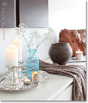
Tonje: Secrets? I'm not sure! But I do have a few basic rules I follow.
For example, I like it when the base is simple, quiet, bright, classic, and then I add visual elements that can breathe life into the interior.
I often use contrasting colors and mix dark and light wood with white and black.
Natural, tactile elements are also great for softening up the interior, for example lots of inviting pillows and blankets on the sofa. Candlelight provides a lovely warm atmosphere. And I like to mix feminine (round, oriental) and masculine (square, angular) shapes to create a balanced interior.
For example, in our entrance area ...
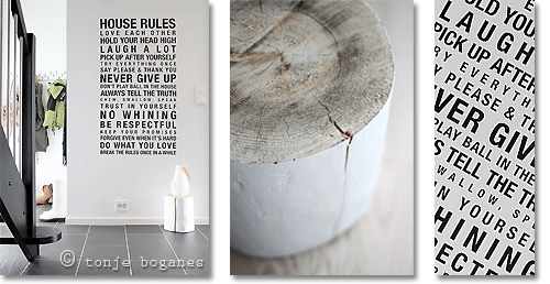
Tonje's Norwegian home: wall decal in the entrance hall
... I think combining the wall decal of the House Rules with the tree stump really makes the room. I just love these rules! And I love the contrast of the black words against the white wall. But without the tree stump, it might have looked more sterile?
Then, there's my work space in the living room:
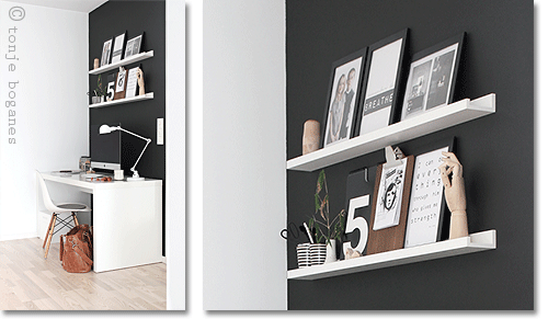
I painted a matte black wall to separate the work zone from the rest of the room. And to soften the stark color contrast, I used a few natural colors that give the corner a more lively and balanced look. This space is often busy. Is it not just I who sit here and blog, edit photos or work - there may be another reading the news, or two young ones listening to music or playing.
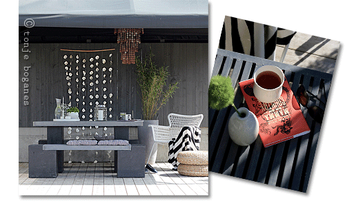
Tonje's Norwegian home: the garden patio
Outside, I have added sound elements: the lamp that hangs under the canopy, the capiz shells at the gray wall and the bamboo bush. The sounds here provide a delicious break from the freeway roar. I have also mixed visual/tactile elements to make it warm and inviting: stones, trees, concrete, green bushes, 'masculine' and 'feminine' garden furniture.
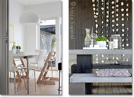
Tonje's Norwegian home: patio view from the kitchen
The patio is very secluded. In the summer when the weather is warm, the door that leads there from the kitchen is always open. We spend a lot of time here. Enjoying a cup of tea, reading and relaxing in the sun while the kids are playing in the garden. Here's another view of our kitchen:
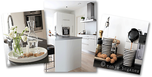
Scandinavian style home, Norway edition: Tonje's kitchen
In the evenings, we often sit in the living room upstairs. The kids love to have Mom and Dad on the same floor when they have settled - it makes them feel safe.
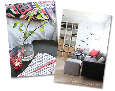
This area is where we spend a lot of time in the evenings, so I have tried to get it cozy and inviting so that we just want to fling ourselves down on the couch and enjoy our free time there.
And whenever we don't sit on the sofa upstairs or at our desks in the evening...
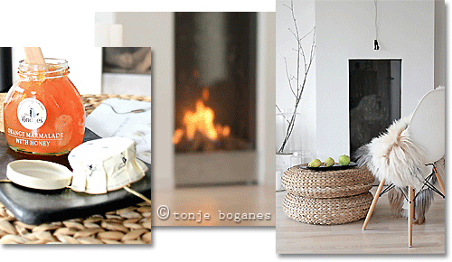
Tonje's Norwegian home: the living room fireplace
... we like to spend time in front of our fireplace. With a cup of tea, a good book and maybe a warm blanket to wrap ourselves in, it does not matter if the autumn rain beats against the window and the wind is howling around the walls. It is cozy.
And then, of course, there's our bedroom ... and that's super cozy!
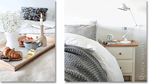
Tonje's Norwegian home: the bedroom
Renate: Wow, Tonje, thank you for this brilliant house tour! And I'm wondering, how do you fit into the Norwegian interior design scene? Are there any specific elements in your home that are recognizably Norwegian? Which ones?
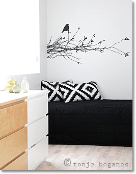
Tonje: Well, I do fit into the general picture of Norwegian interior design, but I also don't. Norwegian homes come in different genres.
You have the lovely country style, the bohemian, the minimalist, the Scandinavian, and more. I also see that colors are heading into interiors more than they used to.
My home has some typical Norwegian elements - raw, 'country', natural - whereas the Scandinavian style tends to be more modern.
But our house also has a distinct minimalist streak - spacious, with very simple furniture - plus some bohemian elements, like ornate silver trays & candle holders and voluptuous colored glass vases. Oh, and that gold cushion. Mustn't forget the gold cushion :-)
Renate: Tonje, that cushion is a stunner! And I'm wondering - almost all the photos on your blog are your own, and your styling is just amazing. Are you a natural, or do you have a design education?
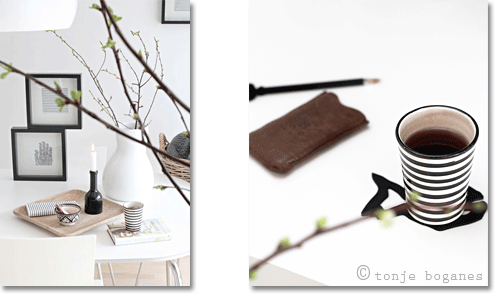
Tonje: Thank you! I don't have an education in interior design or photography. I have learned through the years, inspired by others, by bloggers and by magazines. I trained as a school teacher, and after some years at home with my children, I started taking web design courses. Now I'm working at agrando.no and create web design for our customers.
Renate: And what's next for your home? Any decorating projects coming up?
Tonje: Not sure right now. Usually decorating projects happen when I suddenly get inspired to do something new. Right now, I think our laundry room might need a bit of attention ;-)
Renate: Tonje, thank you soo much for sharing your home with us! It's been great getting a potted Scandinavian interior design education from you - much appreciated!
Tonje: It's been a pleasure. You have a great website!
Yet to find the information you're looking for? Type a word or phrase into the search box below:



New! Comments
Have your say about what you just read! Leave me a comment in the box below.