Purple Color Chart Ideas:
What Colors Go With Purple?
A purple color chart is all about sophistication and elegance.
The color purple hovers between blue and red on the color wheel chart.
It can be either warm (= reddish, e.g. magenta or cerise) or cool (= bluish, e.g. plum or blue lavender).
There's a wide choice of colors that go with purple.
Some of them underline the 'exclusive' aura of purple color ...
... after all, purple was known for millennia as the ''color of kings''.
Others, especially greyed 'heather' hues of purple, are perfectly at home in European country styles.
1. Fresh Plum

Plum + lime green + pale cobalt blue + winter white
↑ Here's a clean, summery purple color chart. It would be perfect for a bedroom or living room that gets a lot of sun. Lime green and bluish purple are opposing colors on the 4-primary color wheel, and lime green is the only warm color in this chart. You could warm up the entire color combination by painting an accent wall in lime green (rather than in plum).
Best wall colors: White, pale pistachio.
Best wood stains: Limed oak, birch, natural maple.
2. Lavender & Linen

Unbleached linen + white + berry + French lavender + deep purple
↑ Nothing says "bed & breakfast in Provence" like this purple color scheme! It's a very robust color combination that can't really go wrong - as long as you use warm neutrals with your lavender hues, like milky whites (as opposed to bleachy-bluish ones), as well as raw linen, hessian, or burlap.
Best wall colors: Creamy white, écru, pale rosy lavender.
Best wood stain: Walnut.
3. Retro Cottage

Olive green + pale gold + pomegranate red + putty + plum + duck-egg blue
↑ Purple is often seen as a 'luxury' color, but in combination with dusty olive green and soft duck-egg blue it takes on a different character altogether. To warm up a purple color chart like this '40s British' palette, just increase the amount of warm red (add brick red, red ocher or burnt orange) as well as olive green.
Best wall colors: Cream, pale duck-egg blue, light putty gray.
Best wood stains: Teak, oiled oak.
4. A Glass Of Claret

Dusty turquoise + bordeaux + grey rose + buttermilk + charcoal + teal
↑ This wine color scheme has a wintry feel to it. I somehow see it on deep, comfy chairs in front of a Victorian fireplace. Both the bordeaux and grey rose hover between warm and cool; teal and its lighter sibling, dusty turquoise, are 'cool greens'. (Charcoal and buttermilk are very even-tempered neutrals).
To warm up interior color combinations like this one, use accents (e.g. wall art, cushions) in burnt orange or rust. This will shift the feel of the entire color scheme from cool(ish) to warm:

Best wall color: Chalky white.
Best wood stains: Dark Mahogany, antique oak.
5. Magenta Meets Mid-Century
Purple color charts that involve magenta (or fuchsia, or cerise) are always in danger of looking garish.

Charcoal + ice blue + mustard + magenta + bright olive
One way to avoid a 'vulgar' look is to combine a vivid, 'hot' purple with equally upbeat but slightly less saturate colors. Here, I've added magenta to a midcentury palette (would make a lovely room color scheme for a retro home:)
Best wall colors: Palest mustard, white, or a very light grey.
Best wood stains: Teak, oiled oak.
6. Lilac Posy
Lilac, that messenger of spring, makes great wedding color combinations with white and fresh greens. But if you group a deeper shade of lilac with light & dark greens in both yellow and blue hues, it integrates very well into everyday life, too.

Lilac + yellow-greens + blue-greens
Best wall colors: Pale sage, ivory, white.
Best wood stains: Rustic oak, antique cedar.
7. Lakeside Picnic

Misty sky blue + rose madder + bright olive green + burnt orange + dusty plum
↑ This 'happy' purple color chart could be right out of a picture book about the upper Italian Lakes. With its dusty, slightly desaturated hues, it looks great against a backdrop of light neutrals, natural wood colors or leafy greens, and makes lovely decorating for a balcony, veranda, deck, or interior courtyard, too.
Best wall colors: Chalky white, pale grey, misty sky blue.
Best wood stains: Oiled oak, teak, vintage pine.
More Interior Color Combinations With Purple
On These Pages:
(Click A Pic)
More About Decorating With Purple:
More Information About Using Color:
And here's yet more inspiration for creating your own interior color combinations:
- Check out this 'color dictionary' - it contains all the important color terms you will need to understand and to create a purple color chart for your own purpose.
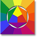
- Interior color combinations can come from nature, fashion, textiles, ethnic crafts - learn to 'read' them with the 3-primary color mixing wheel or with the 4-primary color wheel!
- Understand how you can play off warm and cool colors against each other in a purple color chart.
- How to find the best color combinations: Get the basics right with Interior Design Colors 101 and Choosing Paint Color 101!
- Neutral Color Schemes - The
Book:
Learn about using neutral color schemes in your home. Understand what makes neutral color combinations look their best, and what happens when you inject 'real' color into neutral color schemes. It's FREE!!





New! Comments
Have your say about what you just read! Leave me a comment in the box below.