Small Galley Kitchen Remodel
by Mary
(UK)
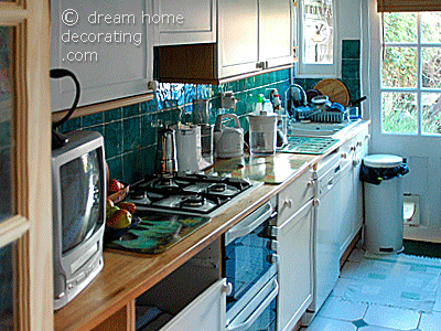
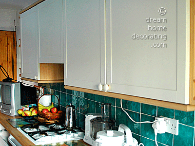
BEFORE: our old kitchen counter
We were preparing our house for selling, and our old kitchen was not just outdated, it was literally falling apart. So, in order to impress potential buyers and bring up the value of the property, we decided to go for a complete kitchen makeover.
There wasn't really much we could do about the original floor plan. It's a narrow kitchen with a door to the back garden, and there would not have been enough floor space for any other kitchen design without losing the garden access that we liked so much.
Here are a few more 'BEFORE' Photos (complete with our children's craft materials, toys and miscellaneous clutter):
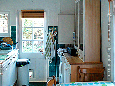
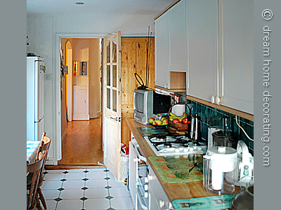
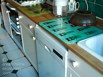
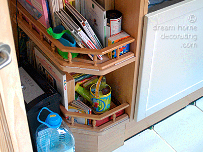
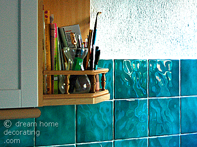
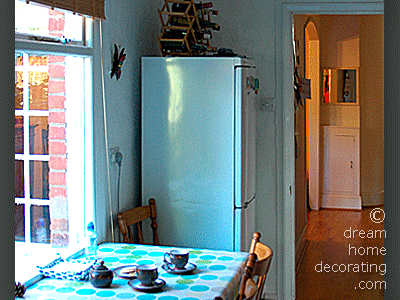
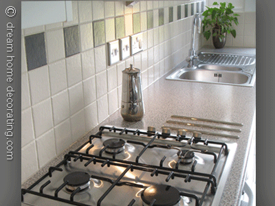
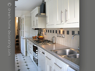
Although we would have liked a granite worktop, we opted for a pretend one but of good quality.
For the cupboards, we chose spray finish matt wood.
For the handles, switches and sockets, hob and extractor hood we opted for brushed finish aluminium.
When the cabinets arrived we had a bit of a surprise - we got a double delivery. There wasn't one new kitchen but two!
Basically, we could have said nothing to our seller and sold the whole thing on if we knew someone was interested ... or kept it in storage and sold it later, but no! We were honest. I think on placing the order the sales assistant must have clicked twice on everything but still charged us only once!!
I think the new kitchen looks amazing! There were absolutely no disappointments or nasty surprises. We loved the way it turned out. Perhaps we were just lucky (or it was our careful planning ;-)
We would achieve a more uniform look and create more space, given that it is a rather small kitchen.
PS) thank you very much for turning my photos into video!
Renate's Reply: My pleasure - they were great pics! Thank you loads for sharing your extreme kitchen makeover with us, Mary! The new space looks amazing! I hope you sold the house for loads of £££s ;-)
Comments for Small Galley Kitchen Remodel
|
||
|
||
|
||
|
||
|
||
|
||
