What Colors Go Well With My Oak Kitchen/Dinette?
What colors go well with my oak kitchen/dinette, and what wall color combinations would pull it all together?
(Reader Question)
Hello Renate,
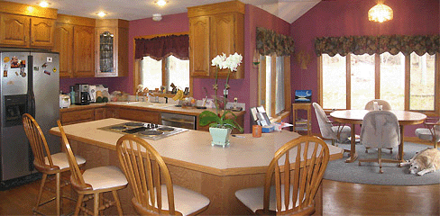
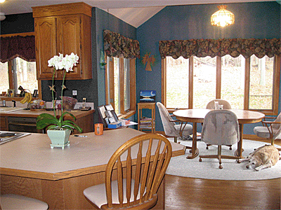
My kitchen has a lot of medium oak in it (cabinets, flooring and trim, even the counter chairs). The dinette table is also medium oak. I love the medium oak, but it's too much of a good thing. I'd like to replace the table with a darker wood.
I thought of buying a cherry dinette table and chairs, but then found out that because cherry has a lot of 'red' in its 'brown', that it would conflict with the oak.
What color wood should I buy for the table, and what wall color would bring it all together? There is not too much wall space to paint; the current wall color is a red-violet in a medium tone.
I'm sending you some pictures of my kitchen and dinette.
Thank you for any advice you can give. It is much appreciated!
Dave (USA)
Hi Dave,
I've played around a little with your kitchen/dinette pictures to simulate different looks and give you an idea of what colors go well with the surrounding color scheme (or don't).
1. New Table & Chairs in Dining Section
Here are two versions of your current dinette with manipulated table/chair colors; the first is a (fake) "cherry", the second a (fake) "walnut":
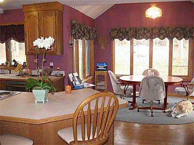
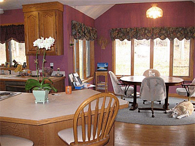
I don't find either of these options very convincing; the darker dining tables look like strangers that have somehow strayed into honey-colored surroundings (floor, kitchen cabinets, kitchen island & stickback chairs, occasional [corner] table and window frames).
And it's not just that the wood colors don't look great together - cherry and walnut are very different in character & expression from oak.
I also don't think a different wall color would be able to fully integrate a darker dinette, particularly as the window frames & flooring in that area would remain honey-colored.
As an alternative to replacing the oak table/chairs with walnut ones,
you could consider a
- a painted table & chairs, or maybe
- a (non-frilly) antique with a 'distressed' off-white surface. Somehow antiques often manage to blend in with contemporary furniture ... not sure how they actually do that, but it seems to work a lot of the time :-)
-
For yet another option, have a look at the work of Frank Lloyd Wright,
who used a lot of warm (orangey) brown wood in his interiors, without producing
a cloying look & feel.
Wright offset the warm wood tones with granite walls or slate floor tiles. These are very alive, color-biased grays; slate in particular can have a strong blue or green cast, which would make it great tabletop material, or you could use the color as a wall paint/wash (with the dining area a lighter tone than the kitchen).
Which brings me to the next point:
2. Alternatives to Replacing the Dining Table/Chairs
You could make significant changes to the look & feel of the whole room just by changing the surrounding colors:
- painting the wall a complementary color
- changing the rug to a lighter or more saturate color
- changing the valances / window treatments
- having those comfy-looking dining chairs reupholstered in a different color (fabric or leather).
Some ideas:
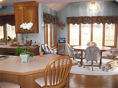
A light bluish-gray wall color & a lighter rug. This is not my favorite option,
particularly because the kitchen cupboards will stand out more against a light background,
which will give the kitchen a less 'integrated' look. Also, with walls in a light color,
you'd really have to rethink your valances as they're quite dark.
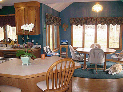
A grayish teal/slate wall color & rug. Painting the kitchen a deeper tone than
the dining area could look quite nice. The kitchen cupboards need a background color
of the same value (lightness/darkness) as the wood, or even slightly darker. This will pull
the kitchen components together and make them look like a unit.
If the version above feels too dark and cool, you could always brighten things
up from below by replacing the dark rug with a light one:
Wall Color Options:
Any colors on the opposite side of 'orange' on the color wheel will help balance the amount of yellowish brown in the room. Depending on whether you base your decision on the 3-primary color wheel or the 4-primary color wheel, the 'complementary' of orange is either blue or bluish green. Either one of those would look good, as long as you go for a muted version with subtle gray undertones.
Good luck with your project!

Hi Renate,
Thank you so much for all your ideas! You've been so generous with your time and talent and you've given me a lot to think about. I've learned so much just from the way you approached the problem.
From looking at the pictures with the darker wood tables, I can see that the result is not what I thought it would be. I'm astonished at the change in the ambiance of the room from changing the color of the walls and rug.
I really like the two-tone teal with the lighter rug, but you're right about the need to change the valances as well. I was definitely thinking too one-dimensional.
Thank you for the tip about slate as well. In fact, I saw a slate tabletop a few weeks ago when I was looking at furniture and didn't know what to think of it because it may have been the first one I've seen. I've always been a Frank Lloyd Wright fan and I'll look into that idea further.
I can't thank you enough. I feel like I'm getting an education in interior design.
Dave
So great to hear back from you, Dave!
If you were to go for a slate tabletop, then I suggest you get the table before you paint, and take your wall color cues from the slate color.
You could also look at giving the walls a colorwash over the first coat of paint, for a more irregular look (if that's your cup of tea at all).
I can't wait to see the final result!

Check out this Mini Bookshop, too (in partnership with Amazon):
Yet to find the information you're looking for? Type a word or phrase into the search box below:

